The purpose of this series “Post Processing Adventures” is to experiment with different post-processing options and to, hopefully, come up with something that looks nice. Tips/feedback/constructive criticism are always welcome. I have also included a link to the original RAW photo so you can make your own adjustments to the photo. I’d love to see what people can come up with. All post-processing will be done in Adobe Lightroom unless otherwise stated.
 Camera: Canon Rebel T1i
Lens: Canon 18-55mm f/3.5-5.6 IS
Aperture: f/4.0
Focal Length: 18mm
Shutter Speed: 1/640 sec.
ISO: 100
Download original RAW file.
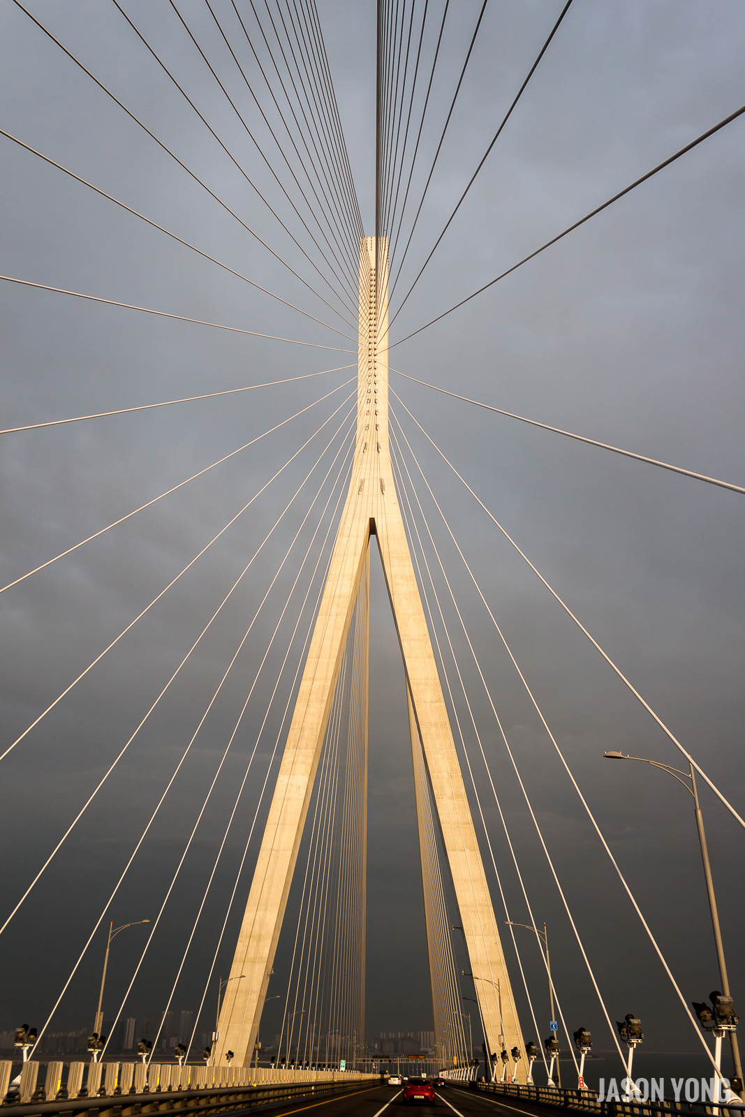
Here’s the original photo that I will be working with. Nothing has been edited/changed at this point. It was taken from inside a van on the way to our hotel from Incheon International Airport (South Korea) at around 6:45pm (near sunset).
Before I begin post processing, let’s make some comments on the photo itself. The lines on the bridge look pretty cool and will definitely be a focal point in the photo. However, the bridge itself looks a little slanted. In terms of exposure, the photo is a tad dark which is probably a result of the gloomy skies.
1. Rotating and cropping the photo
This can be done using the Crop Overlay tool (R). The value of 1.95 was figured out by utilizing the ruler tool (to the left of Angle). This allows you to draw a line on the photo of what you want to be straight. This is extremely helpful when taking photos of landscapes as it allows you to level the horizon. It can also be used to align group photos and portraits of people if you were slightly off in your initial framing.


2. Configuring ‘Basic’ settings to create some ‘pop’ to the photo.
For me, this section is all about playing around with the different sliders and seeing what looks good. Since the photo was taken on a gloomy day, I know that exposure is something that I will have to end up adjusting. In the original photo, you can see that the photo seems rather gloomy so I’ve decided to change the exposure by +1.00. For contrast, I will typically use a value between 25-50. Again, for all these settings, it’s all a matter of taste and what looks good to you.
One thing you can try doing is holding ALT when you adjust Exposure, Highlights, Shadows, Whites, and Blacks. This will show you what is being clipped from the photo based on your current settings.


Another ‘basic’ thing to do would be to correct any distortions with the Lens Correction tab. Lightroom has a database of lens profiles that can be used to correct distortion and vignetting. Whenever I import photos into Lightroom, these two settings are always applied automatically for me.

3. Added a radial filter to the bridge tower
I wanted the tower to stand out more so I added a radial filter to brighten up the middle a bit.

4. Toning down the yellow
From what I can remember, the bridge towers and the lines should be more white than anything else so I need to tone down the yellowness. To do this, I go to the HSL / Color / B&W tab and I change the saturation for Yellow to: -80.
One trick you can do with the HSL tab is clicking the icon to the left of Hue, Saturation, or Luminance. This allows you to hover over the photo and select which colour you want to pick. For example, in this photo, I can click on one portion of the bridge tower and drag my mouse up to increase the slider or down to decrease it. After moving it up or down, it will change the appropriate colours in that area. An area that has a mixture of blue/purple will make the settings for blue/purple go up/down while an area that is completely red will only adjust the red slider.

5. Adding lens vignette
In the Effects tab, there is a section for Post-Crop Vignetting. Vignetting is basically the outer edges of a photo being darker/lighter than the center. This can be done intentionally (through post-processing) or it can be done unintentionally as a result of the lens.
I didn’t want to go too far with the vignetting so I stuck with amount: -5. The other settings are left at default (Midpoint: 50, Roundness: 0, Feather: 50, Highlights: 0). A negative amount means that the outer edges of the photo will be darker while a positive amount means the outer edges will be lighter.
6. What would it look like in black and white?
To make a quick black and white photo, I just clicked the B&W button beside HSL and Color.

Before and After

Conclusion
In the end, I like how both of them turned out. However, if I had to choose one, I would probably go for the B&W one as it seems less distracting and it forces you to focus on the bridge. In addition to that, there’s not much colour in the original photo anyway so you’re not really missing much by having it in B&W.
Let me know your thoughts in the comments!
Leave a Reply